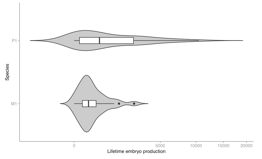
A word of caution about violin plots, that some of you might have encountered already. After casually looking at these (horizontal!) violins to compare their shapes, it struck me that they were misleading – the plots are of reproductive output, and the violins extend into negative values:

Often, we wouldn’t bother checking the scales, if we’re comfortable with the data values. In this case we should, given the impossibility of negative reproductive values.
This issue has been noted before, and it’s because the violins are kernel density estimates, rather than real data values. In a case like this, with negative values impossible, it may be better to use a density plot, i.e. show the actual data. This will work- as long as there aren’t too many data points.
Truncating the scale at 0 isn’t appropriate, because the kernel estimate is independent of the graph scales.

